Despite the dollars invested, resources allocated, technologies deployed, agencies engaged, collective ambition and ego, it is highly unlikely that your website is delivering value for your customers, company and its stakeholders.
Since 1999 Forrester Research has used its Website User Experience Review methodology to evaluate user experience across more than 1500 web sites, spanning geographies in both the B2C and B2B worlds.
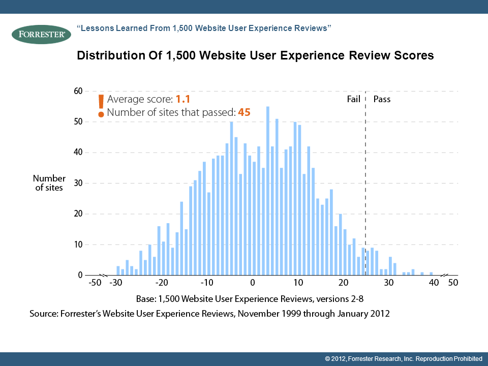
The vast majority of sites have failed and continue to fail to score passing grades. Check out this chart:
Earlier this year, when the chart was assembled, only 45 sites had recorded passing scores of 25+, that’s 3 per cent of the 1500 total.
Unfortunately basic design flaws are costing companies millions of dollars and damaging their brands.
Here are the current top five problem issues:
- Is text legible?
- Are task flows for the specified user goals efficient?
- Does the site present privacy and security policies in context?
- Do layouts use space effectively?
- Is the content that’s required to support the specified user goals available where needed?
Now in its 8th iteration, the methodology is an expert or heuristic review that involves three steps.
- Identify target users and describe typical scenarios or use cases
- Attempt to accomplish their goals (e.g. buy a specific product, download relevant content or research and apply for an account, etc).
- Highlight user experience flaws based on compliance with 25 criteria across four categories: value, navigation, presentation and trust. A score of -2 (severe failure), -1 (fail), +1 (pass) or +2 (best practice) is assigned to each criterion.
Forrester’s advice is not rocket science:
“Fix the problems on your site that prevent users from accomplishing their goals and reap the business rewards.”
Forester analyst Adele Sage says there is “no good reason for a bad user experience”.
“We see the same problems repeated over and over again, year after year, across the sites that we review,” Adele says. “Site owners don’t need any new advice because many of you are still making the same web design mistakes you’ve been making for years.”
Adele says that “the recurring problems that we find in Website User Experience Reviews can be categorized into three distinct varieties of design challenges:”
- Problems for which solutions are readily available. Most common design flaws are well understood foundational elements, such as text legibility issues.
- Problems that can be consistently solved with the right methodologies. The right information architecture depends on what information is being architected and for whom, but even those specific problems may be site unique, human-factors specialist have developed standard methods for resolving them with a high degree of certainty. Design Personas, based on ethnographic research with target users, can guide design decision making to make sure that the content and functionality users need is available where they need it.
- Problems that require innovation. Guidelines and methodologies can help fix most design flaws, but Forrester recommends that you need to differentiate your web experience by following the three principles of what the company calls “emotional experience design. Address customers’ real goals, develop a coherent personality, and engage a mix of senses.
Forrester recommends four steps:
- Step 1: Describe three explicit user descriptions and goals for your site.
- Step 2: Attempt to accomplish those goals (e.g. find the right product and information).
- Step 3: Grade your outcomes against the 25 criteria points that comprise Forrester’s Website User Experience Review
- Step 4: Armed with your hit list of flaws that need addressing, fix them
If not Forrester’s methodology, find one that works for your environment (a variety of agencies focus on this space) and deploy it. If you have the budget, you should also invest in usability lab testing, focus groups, surveys and, of course, be consistently acting on the insight your analytics tool is serving up.
If you’re confident your site is one of Forrester’s three percent that doesn’t “suck” (or perhaps you don’t agree that most sites perform poorly), then you definitely need to be stress testing your faith by committing to a user-centric quality assurance process that goes beyond conventional website analytics that tell you where you have problems but not why.
So, stop making excuses for usability problems. Indeed, what’s holding you back from taking commonsense, practical measures? Could it be that in-house dysfunction is the root cause, inhibiting companies and their brands from engineering and maintaining sites that deliver value?
Nothing advertises internal adhocracy better than a company’s digital presence (not only the web site, but the mobile edition, social capabilities and the cross-channel baton changes, etc). Just look at how many big brand Australian sites failed to deliver during the Click Frenzy campaign (Australia’s equivalent to Cyber Monday) last month.
As Rackspace’s Mark Randall has correctly asserted, those sites did not have the capacity to handle the predictable traffic spike. The ones with “home-made” inhouse solutions were doomed from the get go; as were those who were not monitoring what was happening to their infrastructure. Even many of those that were monitoring were unable to automatically scale up. Again, none of this is rocket science.
Challenge any dysfunction and get your site right.
